
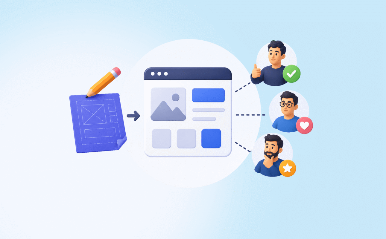
Design to developer handoff is the process of transferring completed design work to an engineering team with enough clarity, specificity, and context that the product gets built accurately.
Done well, what ships matches what was designed. Done poorly, weeks of careful design work erode into a product that looks slightly off in ways nobody can quite name but everyone can feel.
Most products fall into the second category. Not because developers are careless. Because the handoff gave them insufficient information and they filled the gaps with judgment calls made under time pressure.
Research on product team misalignment found that design errors and incomplete communication at handoff contributed to 68% of rework costs.
A 2025 report from Boston Consulting Group found that companies with formal handoff practices reduced rework cycles by an average of 47% compared to teams without structured processes.
Those numbers are not surprising to anyone who has led product design across multiple products. The handoff is consistently where quality gets lost. It is also consistently the part of the design process that receives the least attention and documentation.
This guide draws on over a decade of leading design handoffs across global SaaS products and startup MVPs.
It covers why handoffs fail, what a complete handoff actually includes, how to structure Figma files for development, and how to prevent the quality erosion that happens between design approval and shipped product.
What this guide covers:
- Why most design to developer handoffs fail and what the patterns are
- What a complete handoff must include beyond a Figma file link
- How to structure and annotate Figma files so developers can build accurately
- The states most designers forget to hand off
- How to run a design QA review after development
- How AI tools have changed handoff in 2026
- How Ruhcraft handles handoff as part of the full product design process
Why Most Handoffs Fail
The failure mode is consistent across companies of every size and every stage.
A designer finishes a set of screens. They share a Figma link with the engineering team. The engineer opens the file, finds a polished set of happy-path screens, and starts building. Midway through, they encounter an edge case the design does not cover. They make a judgment call. The designer later reviews the build, finds 20 discrepancies, files a set of bug tickets, and the relationship between the two disciplines gets incrementally worse.
This cycle repeats because both sides are operating from different mental models of the same product.
Designers think in flows and visual relationships. They see what the product should look like and how it should feel. Engineers think in states and logic. They need to know what happens when the input is invalid, what the screen looks like while data is loading, and which component from the library maps to this element.
A Figma file shows the happy path. A complete handoff covers everything that happens when the happy path is not taken.
Most handoffs cover roughly 40 to 60% of what an engineer needs to build accurately. The remaining 40 to 60% gets invented during development. Some of those inventions are fine. Others produce the steady accumulation of small inconsistencies that make a shipped product feel slightly unfinished compared to the original design.
What a Complete Handoff Actually Includes

Many design guides treat handoff as file delivery. It is not file delivery. It is information transfer.
The question every handoff must answer is: does the engineering team have everything they need to build this accurately without making decisions that belong to the designer?
A complete handoff covers six categories of information.
1. All screen states for every screen
Every screen in a digital product has at least four states beyond the happy path: loading state (while data is fetching), empty state (before the user has added any data), error state (when something goes wrong), and success state (after a key action is completed).
Most handoffs include only the default filled state. The others get designed by engineers during development.
Figma’s own handoff documentation explicitly notes that a missing empty state or loading state creates extra tickets late in the sprint. The 15 minutes it takes to design each of these states prevents hours of back-and-forth correction after development begins.
For a product with 12 key screens, designing all states means roughly 48 to 60 additional frames. Teams that skip this step produce products where users encounter blank screens, spinning loaders with no context, and error messages that say “Something went wrong” with no recovery path. Those are not development failures. They are design handoff failures.
2. Interactive states for every component
Every button, input field, dropdown, checkbox, link, and interactive element has multiple states: default, hover, active, focused, disabled, and loading.
When these states are not designed and included in the handoff, developers either invent them or apply browser defaults. Browser defaults look inconsistent with the designed interface and erode the visual quality of the product.
Designing all interactive states for a component library takes 1 to 2 days. Correcting inconsistent states post-development takes longer and creates coordination overhead that damages team relationships.
3. Responsive variants for all key screens
Over 60% of global web traffic is mobile. A design that covers desktop only forces engineers to interpret how the layout should adapt to smaller screens. Those interpretations vary by developer and by time available.
Mobile-first design produces better results across all breakpoints. At minimum, every key screen should include a mobile variant at 375px width alongside the desktop design.
For products with complex layouts, a tablet variant at 768px is also necessary wherever the layout changes significantly between mobile and desktop.
4. Annotations explaining intent, not just appearance
A Figma frame shows what something looks like. An annotation explains why it works that way and what should happen when it does not.
Critical annotations include:
- Responsive behaviour (“this grid should reflow to single column below 640px”)
- Interaction intent (“this drawer should close on outside click and on escape key”)
- Animation specification (“fade in over 200ms, ease-out, no delay”)
- Copy that is final versus placeholder (“this copy is confirmed; do not change”)
- Which library component to use (“this is the Card/Elevated component, not a custom frame”)
- Edge cases (“if the username exceeds 30 characters, truncate with ellipsis”)
Figma’s Dev Mode supports annotations directly on frames. Using it means developers see design intent in context rather than chasing clarification across Slack threads.
5. A minimal design system or component reference
For a startup shipping an MVP, a full design system is not required at handoff. A minimal component reference is.
A minimal component reference documents:
- Colour tokens with names and hex values (primary, secondary, neutral, success, error, warning, background)
- Typography scale (H1 through caption, with font, weight, size, and line-height for each)
- Spacing scale (base unit, commonly used spacing values)
- Core component states (button variants, input states, card styles)
This takes 2 to 3 days to produce. It means every developer on the project builds from the same reference. Without it, developers derive spacing and typography values by inspecting individual frames, which produces slight variations across screens that accumulate into visual inconsistency.
6. A walkthrough session for complex flows
For any flow that involves animation, multi-step interaction, or logic that is difficult to convey through static frames and annotations, a synchronous walkthrough between designer and lead developer is required.
This does not need to be long. A 30-minute screen-share where the designer walks through the prototype and answers questions in real time resolves ambiguities that would otherwise generate 10 to 15 back-and-forth messages over 3 days.
Schedule it before development begins, not after the first review when corrections are already on the table.
How to Structure a Figma File for Developer Handoff
File organisation is not aesthetic. It is functional. When a developer opens a Figma file to find a specific hover state or check a breakpoint, the time they spend navigating an unorganised file is time not spent building.
Page structure
Use separate pages for distinct purposes. A well-structured Figma file for handoff has:
- A cover page with a brief description of the product, version number, and last updated date
- A components page containing the design system or component reference
- One page per major feature or flow, named clearly (“Onboarding,” “Dashboard,” “Settings”)
- An archive page for outdated iterations that should not be built but may be referenced
Frame naming
Every frame should have a clear, specific name. “Frame 47” is not a name. “Dashboard/Empty State/Mobile” is a name.
Use a consistent naming convention across the file. A slash-separated hierarchy works well: Screen/State/Breakpoint. When developers use Figma’s Dev Mode to search for a specific frame, consistent naming makes it findable in seconds rather than minutes.
Section statuses
Figma allows designers to mark sections with statuses: “Ready for development,” “In progress,” “Needs review.” Use these. Mark only what is final as ready for development. Developers who start building from in-progress frames waste time and create rework.
Layer naming
Unnamed layers (“Rectangle 42,” “Group 7”) force developers to infer what every element is. Named layers with consistent conventions reduce the translation time between design inspection and code implementation.
Teams that use BEM naming conventions in Figma layers report significantly faster front-end implementation because the mapping from design to CSS class is explicit rather than invented.
The States Most Designers Forget
These are the consistently missing elements in startup and early-stage product handoffs. Each one costs rework time when left out.
Truncation states. What happens when a user’s name is 45 characters long? When a product title does not fit in the card? When a table cell contains more data than the column allows? Design the truncation behaviour explicitly. “Truncate with ellipsis after 2 lines” is a specification. “Looks good in the mockup” is not.
Validation states. Every form field has at least three validation states: default, error (with a specific error message), and success. Most handoffs include the default. The error state, including the exact copy of the error message, is frequently left out and subsequently invented by engineers.
Disabled states. When a button is disabled because a required action has not been taken, what does it look like? A disabled button that looks identical to an active button confuses users and is a common source of support tickets. Design it explicitly.
Long-list states. What does the list look like with 1 item? With 50 items? With 500 items? Pagination, infinite scroll, or load-more behaviour must be specified. Engineers who receive a design showing 6 neatly arranged items must guess what to build when there are 200.
Permission error states. For products with multiple user roles, what does a user see when they attempt to access a feature they do not have permission for? An empty screen is the default. It is almost never the right answer.
Running a Design QA Review After Development
Handoff does not end when the Figma file is delivered. It ends when the built product matches the design with acceptable fidelity.
A design QA review is a structured comparison of the built product against the design specifications. It should happen at two points: once after the initial build of each major feature, and once before the product ships.
The process is straightforward.
Open the designed screen and the built screen side by side. Work through a checklist:
- Typography: font, weight, size, line-height, and colour match the design system
- Spacing: padding and margin values match the specification, particularly on mobile
- Colour: all colours are drawn from the token system, not hardcoded approximations
- Interactive states: hover, active, focus, and disabled states are present and correct
- Component usage: the correct library components are used, not custom recreations
- Responsive behaviour: the layout reflows correctly at all specified breakpoints
- Error and empty states: present and matching the designed versions
File discrepancies as specific tickets with a screenshot of the design and a screenshot of the build. “The button colour is wrong” is not a useful ticket. “The primary button background is #1D4ED8 in the design but is rendering as #2563EB in the build. Figma reference: [link]” is a useful ticket.
Teams that run design QA reviews before shipping consistently produce products that are more visually accurate and require less post-launch correction than those that rely on developers to self-review against the design.
How AI Tools Have Changed Design Handoff in 2026
AI has improved two specific aspects of the design to developer handoff process.
Faster annotation. Figma AI can generate initial annotations for frames based on component properties and layout rules. This does not replace designer-authored annotations for interaction intent and edge cases, but it reduces the time required to annotate standard specifications like spacing, typography, and colour.
Faster state generation. AI tools can generate loading, empty, and error state variants from a base screen design faster than manual methods. The quality varies and requires designer review, but the starting point is faster than building each state from scratch.
Faster front-end implementation. AI coding tools like GitHub Copilot and Cursor can generate component code from Figma specifications with greater accuracy than was possible 2 years ago. The prerequisite is a well-structured Figma file with consistent naming and a clear design system. An unorganised file still produces unreliable AI-generated code.
What has not changed: the requirement for a complete handoff document. AI tools accelerate the execution of each handoff step. They do not generate the missing states, edge cases, and intent annotations that a designer failed to produce. Garbage in, garbage out applies equally to AI-assisted and manual development.
In design handoff across 10+ global products, the single most reliable predictor of a high-fidelity shipped product is not the design tool used or the experience of the development team. It is the completeness of the handoff documentation. Teams with complete handoffs build accurately. Teams with incomplete handoffs guess accurately. Guesses compound into inconsistency.
A Design Handoff Checklist
Use this before marking any design as ready for development.
Screens and states
- Happy path screens for all key flows
- Loading states for all screens with async data
- Empty states for all screens that display user-generated data
- Error states for all forms and all actions that can fail
- Success states for all key completion moments
- Responsive variants for mobile (375px) and desktop (1440px) at minimum
Component specifications
- All interactive states designed: default, hover, active, focus, disabled, loading
- Truncation behaviour specified for all text elements that can overflow
- Validation states for all form inputs, including specific error copy
File organisation
- Pages separated by feature or flow, named clearly
- Frames named with a consistent convention
- In-progress work separated from handoff-ready work
- Section statuses applied
Design system
- Colour tokens documented with names and values
- Typography scale documented with all properties
- Spacing scale documented
- Core component states included in the component library
Communication
- Annotations added for responsive behaviour, interaction intent, and edge cases
- Walkthrough session scheduled for complex or animated flows
- Final copy confirmed and marked as final in the Figma file
After development
- Design QA review completed against the checklist above
- Discrepancies filed as specific tickets with Figma reference links
- Second QA review completed after corrections are applied
FAQs on Design to Developer Handoff
What is design to developer handoff?
Design to developer handoff is the process of transferring completed design work to an engineering team with enough information to build the product accurately. It includes not just the visual designs but all screen states, interactive states, responsive variants, annotations explaining intent, a component reference or design system, and a walkthrough session for complex flows. A handoff that consists only of a Figma file link is incomplete.
What should be included in a Figma handoff file?
A complete Figma handoff file includes all key screens in their default state, loading states, empty states, error states, and success states for every screen with dynamic content. It also includes all interactive states for every component, responsive variants for mobile and desktop, annotations explaining responsive behaviour and interaction intent, a component library with all states documented, and clear page and frame naming. Sections should be marked with statuses indicating which are ready for development.
How do you prevent quality loss between design and development?
The most effective prevention is completeness at handoff: designing all states, annotating all intent, and running a design QA review after the initial build. Teams that run structured QA reviews before shipping produce products that are significantly more accurate than teams that rely on self-review by developers. A 30-minute walkthrough session between the designer and lead developer before development begins also prevents a large proportion of the clarification overhead that generates rework.
How long should a design handoff take to prepare?
For an MVP with 10 to 15 key screens, preparing a complete handoff including all states, annotations, component documentation, and file organisation takes 2 to 4 days of dedicated design work. This time is consistently recovered through reduced rework and faster development. Teams that skip this preparation typically spend 3 to 5 times the saved preparation time on post-development corrections.
What is the most common design handoff mistake?
Delivering only happy-path screens. Most handoffs cover the default state of each screen but omit loading states, empty states, error states, and interactive component states. Engineers invent these during development, producing inconsistent results that require correction after the build is reviewed. Designing all states before handoff is the single most impactful improvement most product teams can make to their handoff process.
The Bottom Line on Design to Developer Handoff
Design to developer handoff is not the end of the design process. It is the point where design either survives into the product or gets quietly eroded by the practical realities of implementation under time pressure.
The products that ship accurately are the ones where developers had complete information. Not just pretty screens but every state, every edge case, every annotation explaining what should happen when the obvious path is not taken.
Invest the extra 2 to 3 days to produce a complete handoff. Design all the states. Annotate the intent. Organise the file so developers can find what they need without asking. Run a QA review before the product ships.
The alternative is a product that looks like a slightly worse version of what was designed, with no single failure point that can be identified, just a steady accumulation of small deviations that compound into a product that feels unfinished.
If you want a design partner who delivers complete handoffs and stays involved through the development phase to maintain quality, get in touch at ruhcraft.com/contact-us/.